The Departed: Film Review

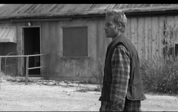
The film The Departed follows the stories of three particular men, each of whom lead vastly different lives in a corrupt, current-era boston. The first man we’re introduced to is Frank Costello (Jack Nicholson), a ruthlessly efficient mobster who has amassed a close following of loyal associates. The next man is Colin Sullivan (Matt Damon) whom we’re introduced to when is only a boy being raised by his grandmother, when Costello is giving him a hefty supply of groceries, courtesy of the small deli he is extorting. After a few more interactions between Costello and Sullivan, it is clear that Costello is a bit of a father figure and mentor for Sullivan, whom we next see as a graduated police cadet. Sullivan gradually works his way up the ranks to work in the SIU (Special Investigations Unit) of the Massachusetts state police; a unit responsible for taking down mobsters much like Costello. And finally we have William Costigan (Leonardo DiCaprio), a police trainee who comes from bad blood. After a hostile discussion with Captain Queenen (Martin Sheen) and Sergeant Dignam (Mark Wahlberg) of SIU regarding his family of thugs and mobsters, they use his tainted family name to their advantage; using him as a mole inside of Costello’s crew to help bring him down. 

This is where the movie starts picking up. The cast is established, the setting is clear and the main task(s) are clear. For Sullivan, that means to subtlety sabotage SIU’s efforts and keep Costello informed, for Costigan it’s to keep SIU informed and build a case against Costello, while Costello (with Sullivan's help) must keep on evading the law, which with the help of Sullivan won’t be too difficult. One particular method Sullivan has for tipping off Costello that something is up is the line “Dad, I don’t think I’ll be home for dinner”. The line is used several times throughout the movie with the occasional garnish to add flavor to the dialogue, and also convey an important part of the message. This line is especially significant because Sullivan grew up with his grandmother, so while Costello was a mentor to Sullivan, he is also a bit of a father figure.

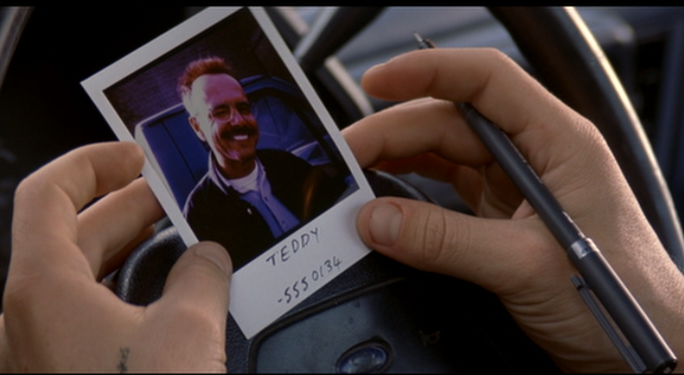
But while Sullivan is trying to keep Costello in the clear, Costigan is doing his best to gather compromising information to bring him down. Somewhere in the intertwined actions of the warring spies (referred to more commonly as rats in the movie), Costello catches wind of a member of his team being an informant. Much of the conversation on Costello’s end from here on in the movie shifts towards the rat and it even portrays itself in the visual aspects of the film. One scene in particular speaks to this with a sudden cut to a piece of paper that Costello is drawing a horde of rats on, before he and Costigan discuss the matter of finding said rat.

As the movie progresses and the action starts coming to a climax the lines between good and evil start to blur. Who is worse, the rat who works to bring down other criminals but helps the kingpin, or the rat who works with the police to bring down the kingpin, but actively perpetuates corruption and crime to earn and maintain the kingpin’s trust? It’s incredibly difficult to go more in-depth without giving away large plot spoilers so I’ll leave it at a line of dialogue that Costello says to Sullivan when Sullivan is a bright-eyed boy learning the life of crime, “They used to say we could be cops or criminals, what I’m saying is when you’re looking down the barrel of a gun, what’s the difference?”

Adv Art: 5 Photos - Dakota Foster

Inky vs. Neon Glow Inky

I took this picture of my cat, Inky, sitting in the sink again. He was very still and very serious faced. I thought I could get close up on his face without him closing his eyes if I moved the light around some. I moved the light so it was directly on his upper body and everything was lite up perfectly. I put the camera on marco and got in really close so, it would be very clear. In photoshop, I changed the color setting to Neon Glow. I thought is looked very abstract, so I kept it. 

Screen Shot 2012-01-26 at 10.00.04 PM
IMG_20111213_194205
IMG_20111213_194205

Adv Art: 5 Photos - Dakota Foster

Dakota vs. Half Pixelated Dakota

I took this picture a while back, I didn't really like any of the other pictures I had taken. Also, I liked this picture because it is focused on my face and nothing else is around and I was thinking about doing this picture for my Self Portait. 
In this picture, I used the Magnetic Loop and outlined that wasn't my face or neck. Then, I changed the setting to Pixelate > Crystallize. I wanted to blur the background at first, but I thought that was really typical. I used the Crystallize because it made a better effect on my face. It makes it look like everything is out of focus expect my face and neck. I think it is a very cool looking picture.
269637_1918327597942_1234562710_31477309_6072969_n
Screen Shot 2012-01-26 at 2.24.20 PM

Sasha's Art Blog Q2


Here, I have:

Large Clear Object:

For my large clear object, I chose to draw a water bottle. I used only a mechanical pencil and some charcoal on a large sheet of paper. The pencil is indeed my favorite and most used choice of medium. I started out by outlining the bottle, at eye level, to get the shape just right. I’m very particular about some things, so I knew that I also had the background to really help give a sense of being able to see through it. So using perspective, I placed the bottle in front of a table and I also added a floor for even more perspective. Another thing to note is that I didn’t use a mid-tone at this time (I wasn’t very fond of it), but instead, I located my shadows, and from there, I smudged to give it that look. More specifically, to show that there was water in the bottle, I had a bit of a cloudy appear to it; it was darker where the water brimmed the edges of the bottle, and lighter towards the center. I added the same shadow effect to the top of the bottle, where I brought out my lights to show light reflection, and well as a transparency of the bottle. The most challenging part would definitely be getting the shape of the bottom part of the bottle and also capturing the shadows. It caved and erected in a pattern, meaning that I really had to find the appropriate areas to highlight. Overall, I think I was successful in capturing the bottle.

5 Photoshopped Pictures:

Link to the photos and descriptions: http://dl.dropbox.com/u/2236943/PHOTO%20SHOPPED%20PICS.pages


Copy A Master:

For this “Copy A Master” assignment, I chose to copy my favorite and most inspirational artist, Masashi Kishimoto. Using one of the volumes of his world popular manga series, Naruto, I copied a page that had half of a poster of the 3 main characters. I drew Naruto    using a .5 mm mechanical pencil, and HB, 2B, 4B, and 9H shading pencils. Pencils are really my favorite medium because it is simplistic, yet definite. While it’s not impossible to be abstract using pencil, I think that it’s better to be straightforward with the image- but of course, the perception of its meaning will vary. So my basic routine involves starting with the head of the model, and I tried to guide my hands using my eyes along the already sketchy lines. Since it was a line art picture to start with, I just tried my hardest to really capture the shadows and the perspective. Indeed, the hardest part was really capturing the partial “worm’s eye” perspective; to be more specific, it was hard catching the view of someone in front, and slightly higher than you. This was one of the perspectives that I hadn’t really toyed with before. What I really enjoyed was capturing the parted lips and the eyes. I think that I really got the shadows on the lips and the above the right eye. Also, I captured the shadow around the jaw-line and nose especially. Through the wonders of a nice dark mid tone and smudging I was able to capture this image.

Unfinished Products:

Internet Sculpture:

What I did for my Internet sculpture was one of my own designs: using old shorts and turning it into a mini-tote. I used two old shorts and for the first side of the bag, I sewed the front of one to the front of another. Overall, I ended up using:


-A sewing machine

-2 pairs of shorts

-Several pieces of fabric

-Needles and thread

-Measuring tape

-Fabric marker

-Safety pins


Ultimately, the design was to have one solid back of the back and then use a different jean color for one half of the front. I then wanted to make a patchwork of jeans and fabric material for the other side. I started by measuring an inch of inseam for where I wanted to sew onto, and proceeded to make one side. Unfortunately, I did not finish this product. I wanted it to be the main piece, but even an artist gets caught up. Perhaps, I was dedicated to completing everything else.

Clear Object Art
Clear Object Art
COPY A MASTER IMAGE FOR ART!
One complete side
One complete side
View from bottom
View from bottom

Adv Art: 5 Photos - Dakota Foster

Daisy vs. Fighting Daisy

I took this picture of my cat, Daisy, she was laying on the couch. I wanted to take a picture of where her paw would be the center of action. I took the picture of marco, so her paw looks clearer than the rest of her body. It took me a while to think of what to do with this picture in Photoshop, but then I remember cartoon fights. Like on Fairly Oddparents, where the characters would be fighting and there would be action words and colorful scenes in the background. 
For the picture, I took the Magnetic Loop and deleted everything in the background that wasn't my cat. I made another layer that would be around the outline of my cat, it is colorful like the cartoon fighting scenes would be. I made another layer and used the text tool to write on my cat's hand, saying 'POW!' The background makes the cat stand out more with her black and white color. The word 'POW!' has one of the colors from the background, so the picture can be cohesive. 
IMG_20111212_213603
IMG_20111212_213603
Daisy 2
Daisy 2

Adv Art: 5 Photos - Dakota Foster

Inky vs. Me Gusta Inky


I took a picture of my cat, Inky, in the sink. He was just sitting very calm, the light from the lamp was hitting him just right. For this picture, I used the Magnetic Loop and took out all of the edges that wasn't my cat. Then, I made another layer and wrote the words 'me gusta'. I was inspired by an internet meme that had a face like my cat and said me gusta. The meme is used for when you or another person like a specific thing and they say me gusta.
IMG_20111213_194158
IMG_20111213_194158
Me GUSTA CAT
Me GUSTA CAT

StudentCam Benchmark Reflection

​Here is a link to my benchmark. 

I chose Internet Censorship, because it would stifle my growth as a student and person. I think access to the internet really allows me to learn about anything I want on the spot, it's learning from a different, more independent way. I really liked the idea of the project, just taking an issue and finding out why it is related to the constitution, I thought trying to explain what internet censorship was hard. Mostly, because everything on the internet is copied, stolen, or borrowed-and-cited. I think the most interesting fact was learning about how they define internet piracy. This project could be improved, by giving checkpoints, although that seems like its childish and students don't want that. This is a project that sneaks up on you, you think you have it under control, then all of a sudden you need video of this, that and the next thing. I ran into trouble with managing my time, because I also had a math benchmark so I was trying to finish that and still pay attention to this project and it just didn't work as well as expected. I think the editing of our video went better than expected, I tried really hard to incorporate my voice as the back bone, the pictures were going to hopefully help tell the story and incorporating the video from the guardians made it feel more complete. I think I would take a different concept for the video, if I was to do it again. I would ideally interview a number of people so the voices change it keeps it fresh. I learned a lot about Sopa and Pipa, and how the government view the internet and how they plan to handle piracy. I thought the government was just letting it go, even though they knew it was bad.

Q2 Art and Statements - Kamilah Hudson's

During the Second Quarter of my Junior year, I was asked to create a list of things for my art class and accompany each of them with an artist statement. Below is exactly that. The first picture is a charcoal drawing of a large clear object. 


LargeClear
LargeClear
​In the picture above I chose a large clear glass mug to draw. I started it over very simple sketching out an outline of it's shape and then building on top of it. Unfortunately the outline was slanted and had some disproportions.I did not notice until the very end of the drawing though. Anyway, after I finished drawing the basic shape of it, I added the shadings, background and extra just for the sake of adding to the volume of the picture. I found this picture medium difficult to complete because drawing still objects isn't my expertise but it isn't completely out of reach of my capabilities. I enjoyed drawing this because I usually don't draw objects often and so do so occasionally like this will me the practice I need in case some time in the future I am required to do so. 
large
large
ParkLove
ParkLove
t5hhf
t5hhf
DSC_0152
DSC_0152
Lost
Lost
​Above Are Five Pictures that I took with the camera of my cell phone or with my laptop and then edited in photoshop in order to change a simple picture into freeze frames of stories. The original assignment was to take 200 photos and then edit five out of those 200 photos in photoshop in some way. Having that much freedom with my creativity I decided that I would take simple pictures and then transform them into something that someone, somewhere, might look at and find some deeper meaning in them. I took three scenery pictures and two pictures of people (one being myself and the other on of my best friends.) Each picture can be interpreted in a number of different ways and I did that purposely because I want each picture to invoke the imagination of people. Each picture represents something meaningful and purposeful to me and I hope that who every sees them can find something they can personally relate to them as well. 
BOOK
BOOK
BOOKORG
BOOKORG
The pictures above are the next part of my art project. The task was to take a picture of an official artist and try to copy their work. Originally I chose to draw a picture made by Hijame Ueda who is the artist of one of my favorite animes called "Fooly Cooly". After thinking about it though, I decided that I needed to draw something that I wasn't used to drawing. I needed to draw something of different style. So I took a picture from a manga called "Me and the Devil's Blues". It was still in the category of the art i was used to drawing but it was more detailed and realistic. The artist of this manga is Akira Hiramoto. As you can see from the pictures above, I found it very difficult to do this picture because I could not get all the lines and angles completely right along with doing the shading right. There are a lot of similarities between the two pictures as you can see but their not exactly identical because of the fact that Akira has a different, more detailed drawing style than mine that I'm not familiar of comfortable with.

The fact that I'm not good with copying images and doing realistic drawings also became a problem on the last part of this project where I had to draw a bike.
BIKEO
BIKEO
BIKE
BIKE

The Kingdom: Film Review

The film, The Kingdom, written by Matthew Michael Carahan and directed by Peter Berg, was a film about FBI agents Ronald Fleury (Jamie Foxx), Grant Sykes (Chris Cooper), Janet Mayes (Jennifer Garner), and Adam Leavitt (Jason Bateman) who travel to Riyadh, Saudi Arabia to conduct an investigation and seek revenge after their friend/partner was killed during a terrorist attack.

I really enjoyed this movie. It was quite an eye-opener, and very visual and realistic. I liked the opening credits because it showed the history between America and Saudi Arabia throughout the years including a timeline with clips of film that were in black and white. This small part of the film really helped me to set a starting point for the movie, as well as the overall tone of the movie. I also liked how the movie began in what seemed like a random setting, which I gradually began to realize was in Saudi Arabia as the movie slowly jumped right into the action.

The dialogue of the film is something that I liked as well. The characters used words, such as curse words at just the right moments to represent anger, frustration, panic, etc, which really was a plus for me, as opposed to many movies that include random curse words in the dialogue which is unnecessary and adds nothing to the film. The dialogue of the film also seemed to really represent each character and define who they were, and made them unique from one another. For example, the character that Jason Bateman played often spoke in a sarcastic-like tone, and occasionally spoke in a way that seemed cocky, unlike everyone else, which really made his role stand out more than the other characters. Also, each character had a different amount of dialogue throughout the entire film, which also helped me to understand the character’s role, and their importance in the film.

Out of the entire film, the thing that stuck out to me the most, however, were the costumes that were used in the movie. Once the main characters arrived to the plot setting (Saudi Arabia) of the film, Colonel Faris (Ashraf Barhom) constantly reminded the main characters that their protection was his main concern, and that they must be careful at all times. With that said, the costumes in the film played the most important role to me because during most of the film, the main characters were surrounded by the army and police officers, who all wore the same uniforms and outfits. This created a sense of uneasiness and on-the-edge feeling for me during the whole movie because I never knew if someone was going to jump into any of the scenes and attack the main characters.

The Kingdom was a great movie that I recommend for everyone to see (however, I wouldn’t suggest it for younger kids) and was a definite eye-opener, especially the ending. The ending was completely unexpected, and really made me think. I assumed that the ending was going to be the stereotypical happy conclusion where everyone went home feeling good because they avenged their friends death and prevented future terrorist attacks, and right from there go straight to the credits. However, the ending was not that at all, and definitely did not disappoint.

Requiem for a Dream: Film Review

Requiem for a Dream, what can I say that hasn't already been said? Well, actually probably a lot. Let me start off with my god honest opinion of this movie, it is a fantastic movie, but it is not an easy movie. I watched this movie twice, and the first time, it beat me senseless, the movie came across the room and it slugged me real good, so when I watched it a second time I thought I'd be fine, wrong, the movie beat me senseless again, completely remorselessly, and perhaps even harder than the first time. The movie is sharp, strong, and like I said, it hits you hard, not in an action movie way, but in a way that the movie beats on your psyche till all you can do is sigh and hope to feel better later.

Let's start with the title, going at it from the top, you might think, "Kinda a cheesy title." Well, let me break it down, Requiem for a Dream would mean, the song for the rest of the dead dreams, that's one hell of a title, it implies two things we see in the movie, dreams, and them being utterly and completely destroyed. The movie is divided into three segments, Summer, the beginning, Fall, the middle, and Winter, the end. Not exactly cheery, but neither is the movie.

The movie begins pretty weak, to the point where you might think that it could be (gasp) a bad movie. The first few shots are pretty cliche, and don't do anything for me, with several basic shots and possibly my least favorite, a cut down the middle shot that has two images displayed. However, the movie sets its tone so powerfully for that first part, in an opening scene where the main character, Harry steals a TV from his mother in order to pawn it for drug money, specifically money for heroin. Before we even see the title of the movie, we see most of this action, ending with the golden line from Harry's mother, Sarah, "As long it all turns out OK."

The acting in this first scene, once again, doesn't do much for me, the lines are delivered, but the movie starts so suddenly that it makes little sense to the audience. However, the acting throughout the movie is surprisingly good, even Marlon Wayans and Jared Leto manage to be very good, of course Ellen Burstyn steals the show as Harry's mother, Sarah Goldfarm.

The movie, as a whole, is about addiction, and how it ruins lives. Every character struggles with their addictions with a dream in mind tossed aside by their addiction. As the movie moves forward, these addictions become more and more extreme, culminating in frightening situations and an overall terrific ending. But let's not be too hasty.

The movie is heavy on foreshadowing, every single line seems to reek of the stuff, and all throughout the first act, characters seem to allude to their ultimate fate, whether it be something slight, or almost overwhelmingly obvious. The beginning also works hard to establish motifs, the sudden and sharp cuts that signify drug use instantly get in your head, and leave a powerful effect. It also shows the style of camera work, no shots are completely steady, and the camera shakes slightly even in pans to set an on edge move, like I said, the movie is sharp. The score settles into the movie early on as well, establishing itself in the opening sequence.

What you notice, early in the movie is that the shots are warm, not very dark, they let in a lot of warm orangey light to reflect the season the movie begins in, Summer, but as the seasons progress, every single set the movie is in gets paler and less warm, almost colder as the seasons get colder and colder. The tone also changes with the seasons, while during Summer everything is handled fairly well in a relaxed matter, by the time Winter begins, the excrement has hit the fan. The lamer shots disappear, and the movie becomes the violently sharp thing that kicked my ass both times. The dialogue gets more tense too, you can feel the effects of the seasons changing on the characters as the stakes get higher and higher, while relationships between them get more and more strained. The movie's smash cuts pick up, and the transitions are less basic, even disappearing, the effects of constant drug use become painfully obvious in a terrifying scene involving Ellen Burstyn being attacked by a refrigerator. The movie doesn't stop there, it picks up to the point where everyone's dreams are ground into nothing.

The movie is a dramatic and powerful experience sure to entertain and absolutely destroy you. I end this review with a bit of dialogue I had with my sister upon finishing the movie, having never seen it, I asked, "So spring never comes?" To which she replied without missing a beat, "No one makes it through the winter."

Sound: A+, great score and snappy noise makes the movie feel completely real and totally adds to the feel.

Visuals: A, minus the very beginning, all shots are perfect for the tone of the movie, and the seemless transitions during dialogue make the visuals a treat. Not to mention some excellent special effects and make-up.

Acting: A, you can never take Jared Leto too seriously, but that just might be my problem. Besides that, amazing acting, Ellen Burstyn of course stealing the show.

Story: A+, like I said, the first half drips foreshadowing, and the second half drips tears onto my face. A fantastic story.

Overall Grade:
A+, would watch again if I'm ever too happy.

Memento

A killer with Amnesia ? There are very few Suspense/Thriller movies with this concept. When you think of a killer, you almost consider that person an animal. In this case he would technically be an animal because the one of the things that separate a human from an animal is in fact memory.  Go figure.  What this character represents, the structure of the film and the refreshingly new idea brought to the table is what made this movie great, brilliant. Leonard is on a quest of vengeance.  

    This movie starts off with a close up shot of the main character, Leonard Shelby, an investigator that is trying to figure out who raped and killed his wife, looking at photographs of a dead body.

As the move progresses it reveals that Leonard Shelby is in fact the killer of this man named Teddy. The movie is backwards. He takes the photograph of Teddy, then it rewinds back to him shooting Teddy and then all the way back to the Inn where the movies then stops moving backwards and continues forward.  He uses pictures and tattoos for him to remember who he has to kill and where he needs to go because of his short term memory and on the bottom front and back of the photographs he’ll have the person’s name and number and something like “Don’t believe his lies. He is the one kill him.” in order to remember his duties.


The main character can’t remember anything really except the day his wife was killed. His mind is so complex but at the same time understanding. He has the ability to remember something so explicit and yet can’t remember something as simple as a name. The character’s problem is what makes him unique and interesting and makes me want more.

   
    As the film continued I noticed something going on with the colors the director decided to used in this film. Nolan used black and white sequences to show what happens in order and use the parts in color to show it in reverse. This was also a huge part of why the film was entertaining because he kept the viewers thinking and thinking until finally the two different sequences met.  This also made me feel what the character was feeling, confused and lost, which was a good thing.
In the pictures below it shows the two different color sequences, the one in black and white going forwards and the color one is played in reverse.

The middle-end to the end of the story, the main character meets with this woman, Sammy Jankis who at first has a weird relationship with Leonard. He met her during his job before the attack in his home happened. (The attack killed his wife and is the reason he has amnesia) We find out that Sammy was in a car accident. Later on in the movie she kept asking for her insulin but didn’t remember she had it already, neither one of them remembered and as a result she fell into a coma and died.

    There wasn’t much music in the movie but mainly towards the climax it became very intense and scary.  Every time the main character got close to kill someone the music became louder and scary , but right before he does kill the the music is calm which always is scary.
    The climax was also relieving to the mind after all this thinking, it reveals piece by piece and makes sense out of everything in chronological order (black & white) . His wife who was Sammy wasn’t really anyone and his actual wife survived the attack and was diabetic and that his wife died of insulin overdose and not “Sammy”.  Teddy ends up saying that  he even has a “John G”  name. This causes Leonard to write down Teddy’s driver’s plate and and get it tattooed on him and that lead to the very start of the movie to Teddy’s death.
 

Film Review: the Grave of the Fireflies

Film Review: the Grave of the Fireflies

The film begins with a scene of the boy Seita after he is dead, giving the audience a understanding of this movie that it is a tragedy.


The way of using color in this movie is very unique. The scene of dead Seita is shown by using reddish color to portray the character and background, which is attractive since the dead Seita sometimes has some interaction with the actual world, or his memory. For example, when a guard at the train station threw away the candy can that carries Seita’s sister, Setsuko’s bone meal, the dead Seita, or his soul picked it up.


On character portraying, the film shows a strong contrast between different characters. In the aunt’s house, Seita and Setsuko’s cousin always spoke for them while the aunt was mean. Also in the later part of the film, when Seita and Setsuko lived the abandoned mine, without anything to eat, other boys ran pass them with nice clothes and went to fishing happily. Meanwhile, those adults are all different with each other on the attitude of treating Seita and Setsuko, for example, the aunt’s selfish but a little compassion, the old farmer’s sorrow, the doctor’s indifference and the demobilized soldier’s abhorrence, each person has his or her idiosyncrasy.


About the film itself, I have some opinions. Firstly, I consider Setsuko an innocent poor girl suffered in the war, but Seita a ignorant and lazy boy with a simple mind filled with militarism. If Seita really loves his sister, what he should do is not taking her to the seaside and play with her but trying his best to find a work or help his aunt’s family by doing housework. Although he was only thirteen or fourteen at that time, although he was brought up in a rich family, he should have grown mature enough to handle things, and the decision he made to move out of his aunt’s house is totally wrong and childish.


Secondly, being a Chinese, I really abominate what Seita thinks about war. Even before Setsuko is almost dead, he is still dreaming to join the army. What will he think him be doing? Killing Chinese or Americans? Although the main theme of this movie is about anti-war, Seita is apparently some sort of advocator for war.


Thirdly, the film itself is really moving and touches deeply into one’s soul.

Everybody knows from the beginning that this film is a tragedy, but people still feels sad or even cries for Setsuka’s Death. Seita and Setsuka's desperation  reflects the theme of protesting to war and a wish of hope. In the entire war, countless families like Seita and Setsuka's are broken and destroyed, and even seldom does one know whether their government is right or wrong. This film no longer shows a tragedy of a family, but a tragedy of a whole nation, a whole world.

Traitor

Despite the fact it's a terrorist movie which I tend to not like the movie overall was actually rather amusing. There weren't very many parts which I could say were bad or parts I'd really want to critique. It was well done story line wise. The visuals of the movie were very nice with an exception of the angles in some of the running scenes, in the very beginning of the movie there was a scene with the US military running towards a building but the camera was looking at them from almost ground level so the majority of the image was the floor lower body of the people. I felt as if they could have done that better. There was a scene within the movie where they chased down a young terrorist the organization recruited and threw him off the side of a bridge to get hit by a train the angles and the way the camera was worked during the chase scene and the body being thrown was done well. The music in the movie kept it alive it made me feel some what on the edge of my seat as I watched. 

As the main character Samir Horn was organizing and selling bombs to the islamic organizations. He was a former U.S soldier and Citizen. The FBI, and the CIA begin to track Samir as he tries to set up multiple terror attacks on all 50 states. The movie ends with Samir saving his country he puts all of the terrorist on the same bus and it only ends up killing a few citizens and he becomes hospitalized and once he is better he is greeted by Clayton the man who was chasing him down.

Sketch

For this assignment we had to sketch a clear object using charcoal. I was nervous at first because I am not good at sketching or using charcoal. but once you get the outline like shown in this picture which was glass cup it gets really easy. My first steps were to darken the background area to create more depth and shadows. then I drew the outline. Then comes where I take my eraser and create shadows and reflections where the lights were hitting off the glass. Overall it was pretty easy
Screen Shot 2012-01-26 at 6.21.08 PM

Maleena Mel Clear Object, Photos, and Drawer of a person


This is a picture of an clear object of a glass. i drew this picture by using a black charcal and shading the white paper than i had grabed a paper towle and stated to rub it on to the charcal to light it up. Than after that i started to sketch my modle, and after i finished my picture i started to use a pencil to erase some of the parts so that it can look 3D, and real life. Also you can see the parts that i erased and some parts that i had darken up. than you can see that i had made a shadow on the side of the glass so that it can show where the light was shining at, and the light marks where the parts where the glass was shining at. But other than that, there is a picture of what i drew that was a clear and glass object.


The picture on the bottom shows a picture of one of my classmate i drew. Her name is Dejah. As you can see that i drew her figured form top to bottom, but i couldnt get her legs because from a angle i was looking at her from. Well the point of drawing was trying to find the points of how to draw a life thing to paper.

As you can see the third picture and down are the photos edit. I did it o photoshop. i didnt do much but changed it up just a little bit. like put some light into the photo. Also i drew a photo that represents my culture and it economy. and what i did was i drew the picture on my cousin Drawer. And what i did was after i was done drawling in i fixed it up so that it can look just like the photo i seen on Google. other than that those are the picture i took and edit using Photoshop.
Screen Shot 2011-11-01 at 9.40.54 AM
Screen Shot 2011-11-10 at 2.29.52 PM
Screen Shot 2012-01-24 at 9.46.44 AM
Screen Shot 2012-01-23 at 12.32.25 PM
155px-Royal_Arms_of_Cambodia.svg
Screen Shot 2011-12-06 at 11.19.43 AM
Screen Shot 2012-01-23 at 12.32.35 PM

Artist Statement Q2 - Breeanna Noi

​During the second quarter, I did some of the work that was written for the quarter. But, most of my drawings are personal work I've done to improve my art skills. 

Photos 1-3: I edited pictures of my family and I. The first and second pictures are just images I've edited by just pressing a few buttons here and there to come up with an "interesting" photo. My third picture was a picture I edited using a tutorial founded online. It kind of has a 3-D ish effect and I thought it was interesting for a first time editor. Next quarter, I hope to improve my editing skills. 

Clear glass object: I drew a picture of the triangular beaker using charcoal. My biggest problem with drawing with coal was that I usually sketch with pencil and to try to draw with charcoal was a challenge. I used to press hard on my artwork and using charcoal has trained me - which is a good thing. 

Mickey Mouse: I drew Mickey because I was working on drawing people, but everytime I tried, I could never get the face right. So what better way to start improving that drawing cartoon characters? Based on my drawing, I'm proud of the way I drew the face. However, Mickey isn't realistic enough to relate to an actual face.  

Hand: The reason I drew the hand is because I've been working on drawing people. I can never draw an entire person successfully yet, but I work on each body part and improve in order to fit all of the pieces together. 

Next quarter, my goal is to draw an entire person including their face. I'm going to attempt to draw each body part and attempt to draw men since I've only been working on drawing women. 


Screen Shot 2012-01-26 at 1.54.00 PM
Screen Shot 2012-01-26 at 1.45.50 PM
tumblr_ly6khqVXpe1qan8ba
IMG566
IMG566
IMG568
IMG568
IMG571
IMG571

Quarter 2 Art

During this exciting quarter of art class, I decided to get as creative as possible with pictures. But first, I'll talk about my "clear drawing" and "copy a master" assignment.
My clear drawing was of a glass from Senior Prom last year, I liked how the letters turned out, they turned out better than expected. I wish it was straighter though, it was a bit crooked.
I continued with Omar Dogan, I copied him last year as well. I decided to go with something simplistic, yet with a feeling. The girl in the picture doesn't have a name as far as I know, but she has a really determined face. I liked how her body turned out, and wish I could improve on the face. That is an area I struggle with.

As for the pictures, it was good to walk around and take pictures of random views, then imagining what could happen in that specific area.

Finally, my hat. My duct tape hat. It's made of poster board and duct tape. Poster board for the structure, and duct tape to hold it together. I only wish I made the base bigger, and the hat actually wearable.
​Large Clear Drawing
IMG_1803
IMG_1803
​Internet Scupture

(Duct Tape Hat)
IMG_1806
IMG_1806
5/200 photos


IMG_1631
IMG_1631
IMG_1704
IMG_1704
IMG_1743
IMG_1743
IMG_1746
IMG_1746
IMG_1749
IMG_1749
IMG_1704 2
IMG_1704 2
IMG_1631 2
IMG_1631 2
IMG_1743 2
IMG_1743 2
IMG_1749 2
IMG_1749 2
IMG_1746 2
IMG_1746 2
​Copy a Master (Omar Dogan)

888745
888745
IMG_1809
IMG_1809

History Benchmark Q2- Women's Rights

Link to my video:

​http://www.schooltube.com/video/94e0f18067e246029059/

I chose this topic because women's rights is something important to me, as well as a delicate subject. I wanted my project to serve as a reminder of all of the hardships women have gone through in the past in order to be seen as equal. What I like the most about the project is the examples of historical women I've used as examples as well as all of the background research. Something that was challenging in creating this project was picking the perfect sound track and the format in which to present it. One of the most interesting things I came across was the fact that women almost gave up on equal rights several times as well as during WW1. I feel that this project could improve with more description. I did not put as much words in the final presentation as I originally planned. Something new that I tried was using C-Span for this project and I feel that it could have gone better. Overall I really enjoyed this project I felt that it was a very nice change and it really resonated with me. I  now value women's more then ever. 


Clear Object

For the Clear Object drawing, I didn't have much trouble because I already did it in first quarter. I think I've excelled at drawing clear object. Especially, shading because when I did the clear object in first quarter, I had difficulty shading cause whenever I did one part of the shading, it never look exactly like the object that was infront of me. I also realized that when I'm drawing clear object, I have to stay at one place with specific lighting because if I left my drawing undone and continued the next class, it makes a huge difference with shading. 
IMG_0470
IMG_0470

Exit Poll Data Analysis

Chart 1:

This chart shows the ages of voters. There is a clear trend: as people get older, they become more likely to vote for Gingrich or Romney, and less likely to vote for Santorum or Paul. My theory is that this is caused by the kind of advertising the candidates use and who their policies appeal to. I find the divide interesting: Paul and Santorum, who are kind of on the fringes of the campaign, appeal to young people; Gingrich and Romney, who seem to be the two main contestants, appeal to older people.


Chart 2:

This chart shows the incomes of the voters. Each candidate has a really interesting trend. Ron Paul's strongest support is in lower income households, and becomes less and less popular with groups of greater incomes. Gingrich has relatively high support across all levels, but his strongest point is definitely in the middle – he has less support among the richest and poorest groups. Mitt Romney is popular in exactly the opposite way as Gingrich: among the richest and poorest, he is popular, but less so among middle classes. Santorum is, like Gingrich, most popular in the middle – but less so among the poorest and wealthiest voters.


Chart 3:

This chart is the results of the polling question, "What quality matters most to you in a candidate?" I found a few things most interesting. First, each candidate has a clear weakness: clearly, Romney does not appeal to anyone who wants a "true conservative", and Gingrich is not considered to have strong moral character. Santorum is not popular among those who want an experienced candidate, and Paul is not favored for beating Obama. Another great analysis of this chart is the fact that there seems to be an inverse relationship between having strong moral character and being able to defeat Barack Obama. Clearly, people do truly believe that those who are morally true can succeed in politics. And, apparently, for good reason: there is also an inverse relationship between those who are favored for experience and those who have strong moral character!


Phoenix Models Casting Calls

An ad/card for a casting call. Modelling gives people the oppurtunity to be pampered and beautified. It helps boost self-esteem and for the most part is fun.

Anybody looking to be in the world of fashion.

Everybody wants to be considered pretty and what better way than to have your face represent beauty in every aspect of the word.

If i were to do this again i would have a video incorporated with the casting card

Screen Shot 2012-01-20 at 15.50.13

State of the Union

 STATE OF THE UNION 

 While we watch Obama deliver his State of the Union Address comment in this chat to express your opinion(s) on the topics he discusses, and the plans he lays out for the country.

-Post Questions if you are unsure of what he is talking about
-Clarify the questions others have if you understand
-Express your opinion on what Obama discusses
-Express your opinion on comments your peers make
-Comment on the data visualization to the right of the video clip
-Direct your comments at specific peers to clarify your posts

LINK FOR ENHANCED VIDEO OF ADDRESS 

LINK FOR TRANSCRIPT OF ADDRESS 

State of the Union

 STATE OF THE UNION 

 While we watch Obama deliver his State of the Union Address comment in this chat to express your opinion(s) on the topics he discusses, and the plans he lays out for the country.

-Post Questions if you are unsure of what he is talking about
-Clarify the questions others have if you understand
-Express your opinion on what Obama discusses
-Express your opinion on comments your peers make
-Comment on the data visualization to the right of the video clip
-Direct your comments at specific peers to clarify your posts

LINK FOR ENHANCED VIDEO OF ADDRESS 

LINK FOR TRANSCRIPT OF ADDRESS