Veronica Nocella- Media Fluency
At first, I thought creating a slide that easily depicts who I am would be easy. It shouldn't be too difficult just listing my interests and finding images to depict them, right? That was actually my first idea, though if I were to follow through with that, it wouldn't be visually captivating.
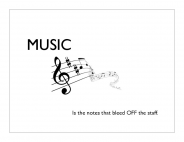
So, I decided to find one thing that I think represents who I am the most, which is music. Music has been very much apart of my life ever since I was a child, and it's something that will probably stay with me for the rest of my life. My father always played his guitar around me, and my uncle always took me to classical concerts.
I wrote the word "music" in a large font, in order to draw attention to it. I've also attempted the rule of thirds by adding a picture as well as a brief saying. I tried to create this slide in such a way so that you'd really only have to glance at it once to know the purpose of it. Not too much information; just enough to catch the eye. I've only stuck to a black and white color scheme.
Reflection:
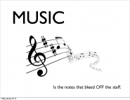
The only changes I made visually to the slide is making the word "music" and the picture slightly larger to make up for the extra, unnecessary space. From creating this slide and watching my classmates present their slides, I've learned about the possible mistakes I could make, as well as the minor things that could make a slide more visually appealing.
So, I decided to find one thing that I think represents who I am the most, which is music. Music has been very much apart of my life ever since I was a child, and it's something that will probably stay with me for the rest of my life. My father always played his guitar around me, and my uncle always took me to classical concerts.
I wrote the word "music" in a large font, in order to draw attention to it. I've also attempted the rule of thirds by adding a picture as well as a brief saying. I tried to create this slide in such a way so that you'd really only have to glance at it once to know the purpose of it. Not too much information; just enough to catch the eye. I've only stuck to a black and white color scheme.
Reflection:
The only changes I made visually to the slide is making the word "music" and the picture slightly larger to make up for the extra, unnecessary space. From creating this slide and watching my classmates present their slides, I've learned about the possible mistakes I could make, as well as the minor things that could make a slide more visually appealing.
Comments (5)
Log in to post a comment.