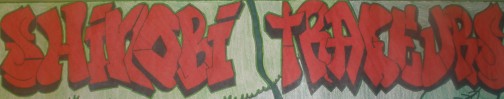
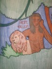
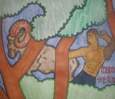
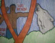
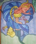
For this marking period I wanted to draw a picture of the Shinobi Traceurs. They are a mixed martial arts and parkour group. I wanted to draw them while they are actually doing some martial arts and parker. So I found some pictures of them in actions. I then drew a forrest background and drew them beside their animals. I decided to draw them with a forrest background because of their animals even tho some of their animals are not forrest creatures. This project was hard to do because I wasn't simply drawing people standing around I was drawing people I know and see everyday so I wanted to have them actually look like the people I was trying to depict. I decided to use both crayons and rakers so that certain parts of the picture would stand out more then others. For example, the words Shinobi Traceurs stand out against the trees because they are colored in red and in marker so they look bolder then the trees surrounding them. I also colored the people in marker so they would stand out against the trees and the grass.
The people in the picture are the Founder Andre Wiley (the lion), Co-Founder Will Thomas (the wolf), and their student Rashaun Williams (the ram), they are the leaders of the Shinobi Traceurs, and in second rank of the Shinobi Traceurs is Tyreé Wright (the dragon). Shinobi by definition is a covert agent specializing in the art of stealth and combat. Traceurs by definition is a practitioner of Parkour, the art of displacement, overcoming physical obstacles in one's environment. Combine the two, and you have the essence of the Shinobi Traceurs.
I decided to draw them because I think what they do is really cool and I wanted to draw a picture of them to show off that coolness using my artistic talents.
For this second quarter digital video project, we were given the assignment of creating a 30second-2minute commercial advertising a product or idea of our choice.The product my partner and I decided to advertise was a glove.With visual and motion graphics we were able to create effects with the glove to emulate a variety of tasks the glove could perform.
The title of my piece is "What I Can See" it is an abstract painting that shows everything that one see's when they first look at someone. It shows the physical qualities of person that would attract another. Everyone has at least one physical quality that they want would like their partner to have.
For my piece I asked others to help me out by answering two questions. Such as When you first see someone what is the first thing you notice? What do you like the most about yourself? Some of the answers I received were eyes, face, smile, hair, complexion, body, lips and more. So I wanted to use as many of those answers as possible.
After putting some thought into it I came up with my painting. I like you or want you for what i can see.
For this marking period i decided to paint something that i loved, Japanese Characters. Specifically from anime (Japanese Cartoons). The anime i choose was Naruto. It's interesting to me how a single miss placed brushstroke or one too many could make the character mean something entirely different. The characters in the blue box stand for nin-dog (Ninja-dog) and Jashin (A type of religion). The ones in the green box stand for 四- forth or four
代-generation
目- japanese counter
火- fire
影-shadow but when said together it reads 四代目火影 - Yon Dai Me Hoo Kage or Yondaime Hokage. The characters in white stand for shi, which means death. The one with a black frame and red background stand for shoku meaning food. In yellow near the bottom, that symbol means flower. Lastly the one in the bottom left hand corner is an eye. That eye is the mangekyou sharingan belonging to a character in the Naruto anime. I also did a second painting of a moon and stars. There are no sketches becuase it was something i just felt the need to draw. Name of moon painting: Starry Night Name of Japanese Character painting: 忍者の生活 or Ninja no seikatsu meaning The Ninja Life
“"He who controls the present,
controls the past. He who controls the past, controls the future” ~ George
Orwell
For
the final step of my blog post I decided to trace my steps for this project to
revisit and redesign my first blog post.I realized that the reason the congressman I was
trying to reach wouldn’t respond was most likely because I didn’t present my
information in a fashion that was both interesting and compelling, so I have
decided to “start again” and reconfigure this so I can make progress in a
different way.
My
idea is to convince the Politian’s to keep the minimal drinking age 21 and not
raise it as they had previously planned to.Although it may seem like a mute cause, its something I feel
is worth fighting for, and will once again establish my opinion on the matter.
Previously,
I had tried to get in touch with congress through emails.It was less than successful.I have decided that this time around I will
take a more direct approach by gaining the attention of my peers in a similar
age group and getting them to commit to the cause themselves.Alone, one can accomplish something but
together we can accomplish many more things.
Second quarter started and I had no idea what to do for my project. Until I figured that I might as well screen print t-shirts if I enjoy them so much. One of the most difficult parts was to actually pick what I wanted to print on these shirts. My first instinct was to think of inspirational quotes because who wouldn't like wake up every morning to put on a shirt that had an awesome saying on it like, "happiness depends on ourselves" or "years teach us more than books". I just thought was too 'corny' or bland and boring. So I started thinking and remembered that I have always been fascinated with silhouettes. So here are my sketches:
a
b
c
d
Unfortunately, I didn't plan accordingly and didn't expect to need so much time. At first I transferred those sketches onto freezer paper and cut them out but it was very time consuming. I was aware that I could cut them out on contact paper (shelving paper) but unfortunately, I couldn't get my hands on it for a while. I will most definitely never under estimate a project like that again. But the MOST MOST difficult part of the process was cutting the images out of the freezer paper. I forgot how its very challenging to get the contrast right. I had to compromise some of my cutting because I didn't want to have just random pieces cut out. I was able to finish one shirt. I will try to finish the rest of the shirt during third quarter right along with the third quarter project.
I worked on different types of poster making and typography. I got the inspiration from a talented artist on Flickr that I follow. This person creates many interesting pieces with typeface and photos that made me want to create my own.
I used things I heard around me as well as some of my favorite expressions as inspiration. It was difficult to find photos to mesh together to make what I saw in my head. When I decided on the expressions to use, I had to sit down and think about what they really meant. From there, I envisioned a scene or collection oh photos to fit into the words. All the photos I used were from Wikicommons.
The process consisted of deciding on the phrases, finding the photos and arranging the pieces. It was quite to easy to pick the phrases. After that, I had to search the internet to find pictures that suited the scene I had pictured in my head. Through this process, I had to familiarize myself with public domain as well as several Creative Commons Licenses. One I had the photos the real fun started. I twisted, turned, cropped and flipped each picture many ways. I tried out all different fonts, sizes and colors. The fonts, I chose fitting typefaces and in most pieces used color-matching for the photos and fonts.
Ember Ember, was the first oil portrait I ever painted. Prior to this painting, I had virtually no experience or education regarding oil paints. Through trial and error, I somewhat taught myself how to paint with oil, only asking for help once, when I was completely lost trying to clean my brushes (thank you Ms. Hull!). Though I made many mistakes, I did enjoy experimenting with a new medium. Working with oils was a truly rewarding experience. I found that after a while, I really enjoyed painting with them. I came to love the feeling of pushing the paint across the canvas. I don't know if it was just the weight of the paint, or the brush, but it just felt so satisfying to perform each brushstroke. Whenever I painted, all my stress seemed to melt away. Of course, this state of lucidity could have also resulted from the amount of paint thinner that I exposed myself to, cleaning my brushes and all, but I like to believe otherwise...
photo-2
Remove the Mask The second painting I created was titled Remove the Mask. When brainstorming ideas for this piece, I thought of people trying to be everything that they aren't. Not wanting to come off as focusing solely on the negative, I decided to depict this by painting a woman removing a mask from her face. While working on this portrait, I changed my mind constantly. I made her hair various colors until I mixed the right amount of sienna and yellow to get the copper-ish tone that I settled with. Shaping the face was another aspect of the painting that I was quite indecisive about. I was constantly reshaping the nose, brows, eyes, and chin until I got just the right form that I felt good with. Though I was met with many small decision points with this painting, they were certainly important to the overall feel of the painting. I am glad that I questioned every part of my process, because if I didn't, I wouldn't feel as satisfied with this painting as I am now. If you aren't content with your work, how can you expect anyone else to be, right?
For the second quarter, I started off well, but then started to lack
direction. In the beginning of the quarter I steadily worked on my
"doodles." They're just an arrangement of swirls that always seem to
come from my hand when I'm not paying attention. I decided that it
would be a good idea to actually focus on drawing them and make
something of them rather than leave them as scratches on the bottoms of
homework assignments. I simply used a marker and let my hand go. I
really like the way they turned out. To me, they give off a sort of
"whimsical" feel. I really enjoy feeling that when I look at my work.
Every
year, since I was (believe it or not) one year old, I have been making
handmade Christmas gifts for my family. When I was younger, my mom
would put together some Christmas-themed craft for me to produce for
the masses, but as I've grown older, I've begun to create the projects
by myself. This year, I made beaded Christmas tree ornaments. I had two
different designs: candles, and a snowman. these were very
time-constraining to make, but I enjoyed the meticulous and methodical
nature of stringing the beads along repetitively. It was very relaxing
and a nice way to prepare for the holidays.
After
completing that, I didn't know what to do, but I had some artistic work
that had to be done for two of my other classes, so I decided to put
all that I could into that. I have always wanted to learn how to use
Photoshop. I've developed a basic knowledge over time, but I hope to be
able to expand that. This quarter, I worked on removing backgrounds and
merging pictures. I've learned a few different ways to do these things,
some easy, some more difficult, but all useful in their own way. I am
very proud of the progress that I've made with Photoshop and am
striving to expand my knowledge even more.
For
a few days now, my eyes have strayed to an empty Toblerone box by the
windowsill in the classroom. I have always been intrigued by the
triangular prism design of the box. I had been contemplating what to do
with the box. I wanted to use it for some type of artistic purpose, but
I didn't know what. Today, on the last day before the art for this
quarter was due, I resolved to use the triangular side of the box as a
paint stamp. So, I took a large sheet of paper, painted it yellow, and
used the box to stamp blue triangles onto my paper in no particular
pattern. I'm not at all fond of the piece, and I actually disposed of
the painting on my way out of the classroom, but it was still an
enjoyable project to work on, especially because I got to use such an
unusual medium.
For
my quarter 2 benchmark i took a picture of the Love Park sign. Love Park
is a place in Philadelphia were you can come and hangout with friends. Love
Park is as known for being a home for the homeless it is unfortunately true
because there are a lot of homeless people who live there. One
of the reasons why this picture means a lot to me is because it is in
Philadelphia and I am from Philadelphia so I feel as though because I am a Philadelphian
it is necessary for me to know what it is and where it is. Another
reason why this picture means a lot to me is because Love Park is known for being
a great a place to skateboard. And as a skateboarder I have been there a lot so
I can skateboard. Unfortunately it is now illegal to skateboard there now so
the Love Park sign also represents a "Rest In Peace" sign.
In conclusion
I feel that Love Park defines Philadelphia because Philadelphia is called the
city of Brotherly Love and the key word in that is “LOVE”.
My when I started my project I got the inspiration from just babies in general. I love children and the whole concept of life being captured intrigued me. My project for 2Q is one I'm truly proud of because I actually thought about what i was going to do and had a plan. For this project I used charcoal, my favorite, to create my art. Charcoal to me depicts the emotion in each photo. I love the way I can cover the whole page from top to bottom in color but my art still look soft and feminine. With other methods of coloring it would've made my pictures to firm and crisp and I didn't want that.
For this project I decided to make a "Life" collage. The first project in my piece was a nude mother who is clearly pregnant. She is facing away from us and covering up with a sheer shawl that is draped over her pregnant frame.
When viewers see this the first thing I want them to notice is the softness of the photo, almost as if she is caressing herself. She is nurturing her body because she has life growing within her.
The next part I drew was the heart and this really has to be my favorite part. One because the colors just pop out at you. And again the charcoal gives it that soft look. Which in this photo is weird because the black background gives it a very crisp edge to it that i also like.
The other two parts were kind of together, they are fetuses. One is bigger than the other one and i drew this because it depicts whats going on in the inside. On the bigger fetus you can actually see the slight smile on it. yes that was on purpose.
I decided to put these photos in a collage which is not fully come yet. By the end of this is finished I should have other components to fit around my pregnant lady.
Originally I was suppose to work with recycled items to develop a work of art, instead I tried my hand at a skill that I've been working on for awhile, which is drawing. I've been frequently taking art classes on Saturday so I recreated some pieces and tried to improve some. Mainly my focus for my this art project was to build on skill that I've been developing. I worked with charcoal, pencil, pastels and toned paper to experiment with the different types of textures and shades to work with when drawing figures or still life.
Some of my drawings are recognizable as some of disney's famous characters. These are just some sketches in my book that I've been working on to give my hand practice at drawing different characters. I know the creativeness isn't necessarily there mimicking a picture, but I find it great practice when it comes to drawing cartoons. It helps to see the simple shapes in the characters so drawing comes more fluently when trying to draw what you see.
In my art classes we had nude models so there are two unfinished figure drawings where I worked with charcoal and shading in the dark spaces. When figure drawing it came natural because my hand has become accustomed to drawing the shape within a figure itself, in trying to give the drawing dimension I had to focus on lighting and the gray scale to make the figure pop.
I worked with pastels for the first time drawing a pitcher, a wine bottle and some squashes I didn't get very far in my design, but I've very pleased with what I have so far. This was very different from using charcoal because black wasn't the only highlight color to make the objects pop out, we had blues for yellows and oranges to figures stand out.
My 2nd quarter project was a simple back to the basics of drawing, with few sketches, and side experiments. The practice will do me well in the future for our third quarter assignments.
For my second quarter art project I decided to move back into the realm of illustration with my artwork. At first I wasn't really sure about what I wanted to draw. I spent the majority of my free time over winter break watching horror films with my cousin, and then the idea hit me, "I should draw a monster from one of these movies." It wasn't very difficult picking the creature I wanted to draw. Well, my one friend used to have an internet girlfriend from Ireland, and my cousin and I, being the A-holes that we are, used to make fun of her and call her The Creature From The Black Lagoon. She became my inspiration, and I added feminine features to my illustration to display this. My cousin also assisted me with the shading. The types of media used were pencil and a Pilot G-2 Rolling Ball Gel Pen. I couldn't finish the piece all the way because it was quite labor intensive and took a while to do, as I take my time to draw.
During my years in high school I always saw artistic people drawing these shapes and patterns on a piece of paper, and to me, it looked so abstract and creative. I've always wanted to somehow mimic those designs yet, I never believed that I was artistic enough to do it until this project came along and I decided to do it. I remember seeing this picture that was half the face of a tiger, and the other half had crystals coming out of it. So i drew half a tiger's face and the other side, decided to draw the creative designs.
102_0012
102_0013
102_0014
I'm not done yet but over the next quarter, I plan on outlining the tiger and coloring the other half with color pencil...and finishing the design. As weird as this might sound, I found the project really challenging because I don't consider myself an artistic person so when it came to doing different designs, I found it really hard to do. I was worried that instead of looking abstract it would look clustered and just wrong. So before I even started it on the actual tiger, I drew an outline of a circle with a paint can and did different shapes in the circles.
102_0030
102_0029
After doing these I had the courage to start on the real thing, not because I was ready, but because I figured that you can't really plan out what to draw for things like this. So yeah, it was fun overall and I wouldn't mind doing it again. It's just frustrating trying to figure out how to fill up blank spaces. =]
Artist Statement Why you did what you did? What does it mean to you? What did you use to make it.
Hi my name is Samuel Kabangai, i attend school at Science Leadership Academy, i am the artist that created this design. For our second quarter project, we the students had a choice to pick our own art that we wanted to work on and a project that meant something to us.
I wanted the project that I choose to mean something and represent a part of me that I am proud of. I was born and raised in Sierra Leone west Africa and my African heritage is something that I am very proud of. Another thing that influenced my art was my name. I have a unique last name and all my friends and people i know have different ways to say my name. One of my friends Devonte Martin told me that my name can be a trade mark. The art that I decide to make is custom made shirts that had hand made drawings and different designs of the map of Africa and my name. I am a person that loves fashion and so I decided to put these designs on t-shirts that I can wear and so could other people.
The tools that I used to make my shirts were things that can be used or acceded by anyone and they are affordable by anyone. During the process of the project I got a lot of help from my art teacher Ms. Hall. After I drew the designs of the shirts on paper, I used a box cutter to cut out the outline of what I had drew so it can look like the way I wanted it on the shirts. After I drew the design on paper, I traced it on shelfing paper and cut out the the design that I wanted to show on the shirt. After this process, I used a paint brush, dipped it in fabric paint and slightly tapped the paint on the out line of my design, while it was on the shirt.
These shirts that I have made and the ones I am going to make mean a lot to me because it was an idea that I had, a design that I made and it had a theme that I was proud of and I followed it and made the art. I am happy to see the reactions on peoples faces when they see the shirts and I am happy to see people wear the shirts. I hope this idea gets bigger and greater. More designs, art work and t-shirts and coming soon.
Origami
as a whole is an interesting and creative art. It focuses on structure building
and folding techniques that add up, giving the art piece all it’s magnificent
details and realistic qualities. During the second quarter of the school year I
wanted to incorporate origami in a form of a sculpture, to be shown as a prop
or a decoration. Starting off with the design and blueprint of the sword, I
then went on to create the necessary materials to create my sculpture using
scrape printer paper.
To
start this project I had to find something I could get inspired to build.
Looking at multiple designs I choose to create a prop sword from one of my
favorite Massively Multiplayer Online (MMO) game, Runescape. In the game it
features a great sword created by one of the Runescape Gods, a powerful great
two-handed sword with the power to strike down foes with lighting under the
name of Saradomin. It was something I’d really enjoyed from the game and I
thought I create it as a cosplay item for my own self-enjoyment.
Looking
at a picture of the sword I started creating the blueprints for the sword. It
was an easy process to do as I just simply scaled down the sword to a size I believe
was right. Creating a 1ft handle with a 3ft blade that totaled a
4ft design for the sword. But also using a protractor to get the angles of the
sword so that it precisely reflects the sword, it’s details, cuts, and distinct
sharpness. Then it was on to the process of planning every single detail that I
was going to do and how I was going to do it.
In
order to make the prop I first had to create the material needed to create the
structure and fame of the sword. Some call this glued paper layers of a single
printer paper but I know it as harden paper because it is much harder then card
stock. To make this material, the materials needed are glue, printer paper, and
a waiting time of about twenty-four hours to dry. First step was to fold the
paper precisely in half or the piece would be crooked, then applying a layer of
glue, and finally repeating that process on the same paper, making sure that it is
flat and there are no air bubbles. Last step was drying it under a large object such
as a book for twenty-four hours as it tends to warp during the drying process.
After
the harden paper became harden, I started building the structure of the sword.
Adding on layers of harden paper to a point in which it could hold its own
weight and in the form of a T shape. On the structure of the sword I drew an
outline of the sword with a pencil, protractor, and ruler until it fit the designs
of my blueprint. Using two small long sticks as support on both sides of the
sword it became clear how sturdy and balanced the sword will become and it was
time for the final part. Covering the wooden support in a matter where it shows
the thickness and detailed parts of the sword. Afterward getting assistance
from a fellow classmate, Natalie Sanchez to paint the sword mainly due to the
reason that I’m not a descent painter. Combing multiple shades of yellow and
silver that truly brings out the brightness and power of the god sword.
Through
this experience, I’ve learned a lot about my abilities and creating art. This
was a memorable experience as I combined two different kind of art together
into one form. Such as I made it a home project to work on none stop, where one
time I was up still working until 3 a.m. and during Thanksgiving. Which I’ve
truly enjoyed this process and this opened a new window for my next home art
project that I’ve already started.
My
name is Vichhay Roeung, and I am junior at Science Leadership Academy. We were asked to build something
we enjoyed or dreams of out of recyclable material. My sketches started out as
simple lines, doodles, about what I wanted to make. What is there to know about
me is that I enjoy learning about war, the history, the political standards,
and especially the weapons of that time. At the time I was still hook on this
new video game Halo Reach, that’s where I was inspired to make a sword. Which
was not just because I’m Asian, I just happen to own a sword of my own to use
as a model. But as the process went on I though I should challenge myself make
a working light saber because I’ve always wanted to be a Jedi, “may the force
be with me,” This is why I am an Artist.
When
building the light saber, I looked around for materials I could use. I didn’t
plan for what I was going to do. Maybe I should have but I didn’t because I
imagined what I going to do piece by piece. It may not had been a potential
plan but we needed to use our imagination more often or we will never be able
to create something wonderful without the creativity and far reaching goals of
imagination. Nothing really goes as plan so I didn’t expect my art to be
perfect but I expect it to express me. The way I made my light saber handle
shine blue in the dark or with a different shrine the color changes to an
orange glow for the plastic section.
At
first I knew I wanted the light saber to be authentic so there had to be a
light source so that it can shrine and be like an actual light saber. I started
with the handle; the handle consists of two-laundry cap, which I covered with
the construction paper that holds toilet paper. But what kind of handle would
it be without something that helps as a grip for the light saber so duck taped.
Which worked well in giving a grip like feel to it but also an authentic look
as if it was a piece of cloth on it. Now it was time for the difficult task
using something that the light could shrine through but also a cylinder. Which
was the reason I choose plastic bottles. I tried many ways to attach them
together but it didn’t work. First was using staples, which gave no support as
did glue. As a last resort I used duck tape, the only other way to attach them
would be heating them together but I highly doubt I’m allow to because it
involves fire.
The
light saber right now is pretty amazing. It glows; it’s durable, and it fluent
in it’s movement when I do stunts with it. All in all it was fun making it and
now I got a light saber. My technique in this art was simple, just create and
fix later. I actually plan on adding more, adding transparent paper so the
light will be trapped more in the bottle but also look more processional.
I
really hope to build on from this experience. My life’s goals from art are really
just to make an energy sword from the video game Halo and my art career is
finish. I saw my mistakes, the problems that came up, and even the solutions
that I came up with to fix it. Such as this was truly a wonderful experience
because it was building something about me, something I could use to express
who I am and what I enjoy.
For the second marking period I didn’t know what to do until one day I was so
angry that I wanted to draw how angry I was. I realize I need something to do
for the art and I thought that I should draw about my feelings. The first
picture is about how I wanted to go back to Africa while I was talking to my
friends from Africa. The flowers next to it are one of my favor flowers from
Africa. The second picture was drawled before taking a math quiz and the only
way I would have remember one of the question on the quiz was by drawing it.
The third picture was drawled the day I realize my block is a long block. Since
I live at the end of the block and every time I walk up the block I feel like
I’m walking a mile. The fourth picture was drawing the day I got my history
benchmark, I felt like I was in hell because I didn’t know what to do but then
when I was done with the benchmark I was so happy that I felt like I was in
heaven an that’s my definition of heaven and hell. When the fifth was drawing
when I went back to the middle school I used to attend and I saw some of the
pictures I toke during middle schooling and I want to redraw them into one
picture. The last picture was drawled the last day this project to was due
because I want to sign off, that I’m done with is project. I really enjoy doing
this project because I got todraw how I felt most of the time and every time I draw my feelings I
feel good about it. With or without this project I will continue drawing my
feelings.
I slowly strolled down the vacant
and wide hallway, carefully making my way down the small steep, still no one in
sight. ‘I must be a few minutes early’, I thought to myself.I then sit down, pull out my laptop,
and opened Microsoft word. I hit the play button not sure what song will play,
then I hear the instrumental of the song “Got Your Back” by T.I. featuring Keri
Hilson. The smooth repeating beats started to play. As I hear the beats I
started to write, not stopping to think but off the top of my head. I then felt
a soft motion on my back. I pause the music and turn around to see one of my
friends.
“Hey”
‘’Hey”
“What’s up?”
“Nothing much. Just listening to
music.” My friend then looked over my head at my paper. She’s picked it up and
started to read it.
“You writing a rap?”
“Yeah, why?”
“Nothin’, I just didn’t knew you rapped.”
“Not really. It’s just poetry I
write and if I find a beat to match it then I rearrange the words.”
“Yo Bre.”
“Yea”
“Why you write so proper?”
“What do you mean?”
“Like you write the whole word out. Going, it’s ‘pose to be gonna, trying to be
is ‘pose to be trynna be. If you supposed to be rapping you gotta rap like you
black. Can’t use all these full and proper words. It don’t sound right. You
sound so white.”
As she said those
words, I thought about how I wrote and tried to relate it to how I talk. If I
was doing the same thing but saying it out, the lyrics would have sounded a lot
differently than how I would have written on paper.
In the words of
James Baldwin, “It goes without saying, then, that language is also a political
instrument, means, and proof or power. It is the most vivid and crucial key to
identity: It reveals the private identity, and connects one with, or divorces
one from, the larger, public, or communal identity.” What he’s saying is that
people use different languages or dialogues in their multiple environments.
This can also be known as code switching.
Growing up, my
primary language was English, but since I am also Hispanic I also heard Spanish
all around me. When I first started school, I was put into a Spanish Immersion
Program where all my classes were taught in Spanish. When I was little I began
to say small words like hola = hello, agua = water, and padre = father. I had
taken the Spanish immersion classes until 5th grade. I felt as
though I had an advantage of everybody because I grew up hearing and beginning
to speak Spanish.
A time when there
was conflict dealing with my language was when I was in Spanish class in 7th
grade. No one was paying attention in class except for a few classmates and I.
The next class period people who I haven’t even met before started to come and
ask me to help with the Spanish homework. I asked them why me? They replied “because
you’re Spanish you’re supposed to know this stuff.” Hearing that comment made
me say no and continue to say no to anyone who asks me in the future. Not only
are you stereotyping because of my race but you’re also assuming that since I
talk Spanish in class, I talk it every single second of the day.
Another time there
was a conflict with my language was when my friends and I were hanging out.
There were a few business people walking around our school, and I was talking I
guess you can say “ghetto”.
“Yo brov” said
Person 1.
“What’s up man? Yo
Bre” replied Person 2.
“Hey” I said.
“Whatsup witchu?
Person 1 said.
“Nothin’ much,
just chillin. Haven’t seen you in a minute.”
“Yeah I know. Been
getting that bread.”
“O ok. You better
be.”
From just hearing
my voice and looking at me they assumed that I was unintelligent, loud, and unproper. But what they didn’t know what that I had to perform a welcome speech in front of them.
Once they saw me again about to perform my speech, I saw this look on their face. It looked as if their face was saying,
'she's going to act the same way she had before" But once I started speaking
with a lot of new vocabulary that isn't on my grade level, my grammar, and the way
my voice echoed throughout the auditorium, they looked and seemed shocked. As if they
didn't think I could talk and act just like them. Caucasian, businessmen and businesswoman who has excellent vocabulary, speech, dialect, and can persuade an entire audience. I was just like them, the only different is my skin tone, race, and I'm a whole lot younger.
According to James
Bolding, “language, also, far more dubiously, is meant to define the other—and,
in this case, the other is refusing to be defined by a language that has never
been able to recognize him”
Language is a helpful
way to see the personality or intelligence of the person speaking. It cannot
completely define a person but it can show you where someone came from and the
way they carry yourself.
Never forget where you came from and what makes you, you.
“How is the family?”
my father asked my Uncle Lyee
“ Good, we in America
how bad can it be?” Uncle Lyee replied with a laugh.
“Where are the kids?” My father
asked.
“ FATiMAAAAAA and HAWAAAA!”
Uncle Lyee yelled out my cousins’ names but they didn’t answer or come so he
told me that they were in their room and I should go and call them. My father
reacted to the way my uncle spoke to me but said nothing. My uncle spoke to me
in English but my father thought he was going to talk to me in Mandingo.
“ Hey, Uncle Musa!” Fatima and Hawa
greeted my father in English.
“How are you
guys?” my father asked in Mandingo.
“ Good, we didn’t
know you guys were here.”Before
they could finish their sentence, I kept tapping their feet so they would
answer my father in Mandingo but they didn’t understand the message.
“You guys don’t
know how to speak Mandingo anymore?” my father asked, angry.
“What do you mean Uncle Musa?” Fatima
asked my father in English again.
My father told her
that this is exactly what he was taking about. Every time he asked them
something, they always answered him in English. Then he turned to my uncle and
asked him why his children responded in
English when a person is talking to them in Mandingo? My uncle didn’t have an
answer to the question. My father also said that no family of his
is going to avoid their native language for another language, whether you like
it or not, just because it is what everyone around you speaks. He also told my
uncle that kids would not know the importance of their native language until
the parents show their child that their language matters. Mandingo is not
taught in the school they go to but English is, so kids can’t learn Mandingo
anywhere else but home and if he doesn’t speak Mandingo to his children no one
else would. From that day on my uncle spoke Mandingo in his house.
One day
after school one of my American friends, Jennifer, and I came into my house to
do our homework. We met my father in the house. My friend and I greeted him in
English. He noticed that I didn’t want to speak Mandingo because I was with my
friend, but he ignored it. Jennifer and I started talking about how our day was
while we were doing our homework.
“ You and
Maya weren’t at lunch today,” I said to Jennifer.
“ Yeah we
was,” Jennifer replied.
Out of
nowhere my father asked Jennifer what she had said.
“I said we was….” Jennifer repeated
nervously.
Then my father told her that she
should never say, “we was” because it is not proper English. The right way is
“we were” not “we was.” From that day on Jennifer never said, “we was” again.
Even if she was about to say it, she stopped herself then said “we were.”
When Jennifer left, my father told
me that he had to talk to me about something, Even though I knew what the
conversation was going to be about, I still acted like I had no idea. He said
that he noticed I didn’t want to speak Mandingo because Jennifer was here. I
told him yes. He said if I would
have spoken Mandingo in front of Jennifer she would have been amazed and would
have wanted to learned how to speak it because she only knows one language
which is English that she can’t even speak proper. He said that I should be
lucky I know more than one language because most children in America speak one,
and half of them don’t even speak it properly. What makes me different from
most of them is where I’m from and the language I speak.
James Baldwin said, “My ‘home’ tongues
are the languages I speak with my sister and brothers. ” This shows that he code
switches and he feels like he doesn’t have to talk to everyone the same way.
The world may not understand his home language but it is not for the world to hear. It is for his brother
and sister to hear and understand.
I feel like James
Baldwin and I share this quote because my sisters, my brother and I no longer
speak French
because we were so busy speaking English in the house. When my father noticed
it, he told us that he brought us to this country to learn, but also not to
forget everything we knew. He said he allows us to speak English in the house
because he didn’t know it was going to get in the they way of the other two
language that we speak. Learning a new language doesn’t mean trashing the old
one. It just means you are capable of speaking three languages and not that
many people are able to do that. Although we can’t speak French anymore my
parents still speak it and Mandingo to us, Luckily we still know how to speak Mandingo!
From that day on to now we are not allowed to speak English in the house.
How I wish I could look
back to understand
Back to when lives were taken
Back to when families were separated
Back to when children were murdered
I wish I could have helped to same them
I wish I could have tried to understand this senseless taking of human life,
they were no different than you or I
They did not deserve this pain, this torture
I wish I could look back to understand, to set lives free to learn their pain
and frustration
Trying to understand;
I can hear their screams, I can hear their pain, I can hear their fear
I can hear a mother’s cry when children are shot down
Oh, that pain so great, so terrible
I can smell the odor, the odor of burning human life
I can smell the sweat, the sweat of hard labor
I can smell the fear, such an atrocity
I can see footage today, trying to learn what had happened to them
I watch the films today, trying to comprehend the pain they went through
We all see the pictures, watch the torture just trying to imagine this tragedy
But the fact is we can’t, unless our human life undergoes this
These poor people, my heart cries out but there is nothing I can do
Oh, please hear me. I am so sorry this had to happen to you
You time is, now, it is here, time o treat, time to be reunited and live
everlasting in that great kingdom called HEAVEN